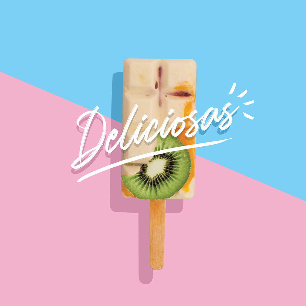
Explosive flavors and pure joy

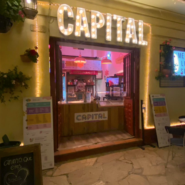
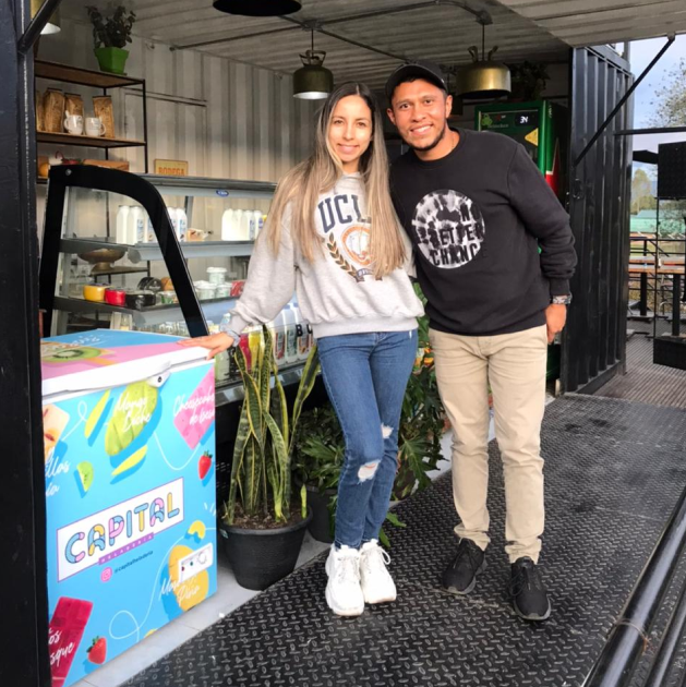
Capital Heladeria is a local ice cream store in Cota, a small town near my hometown of Bogotá, Colombia. I was thrilled to be involved in this branding project, as I put all my heart into making it authentic. It was a family business striving to fulfill one of its dreams, and I was thrilled to contribute!

My process

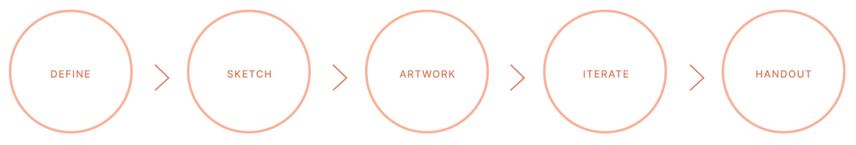
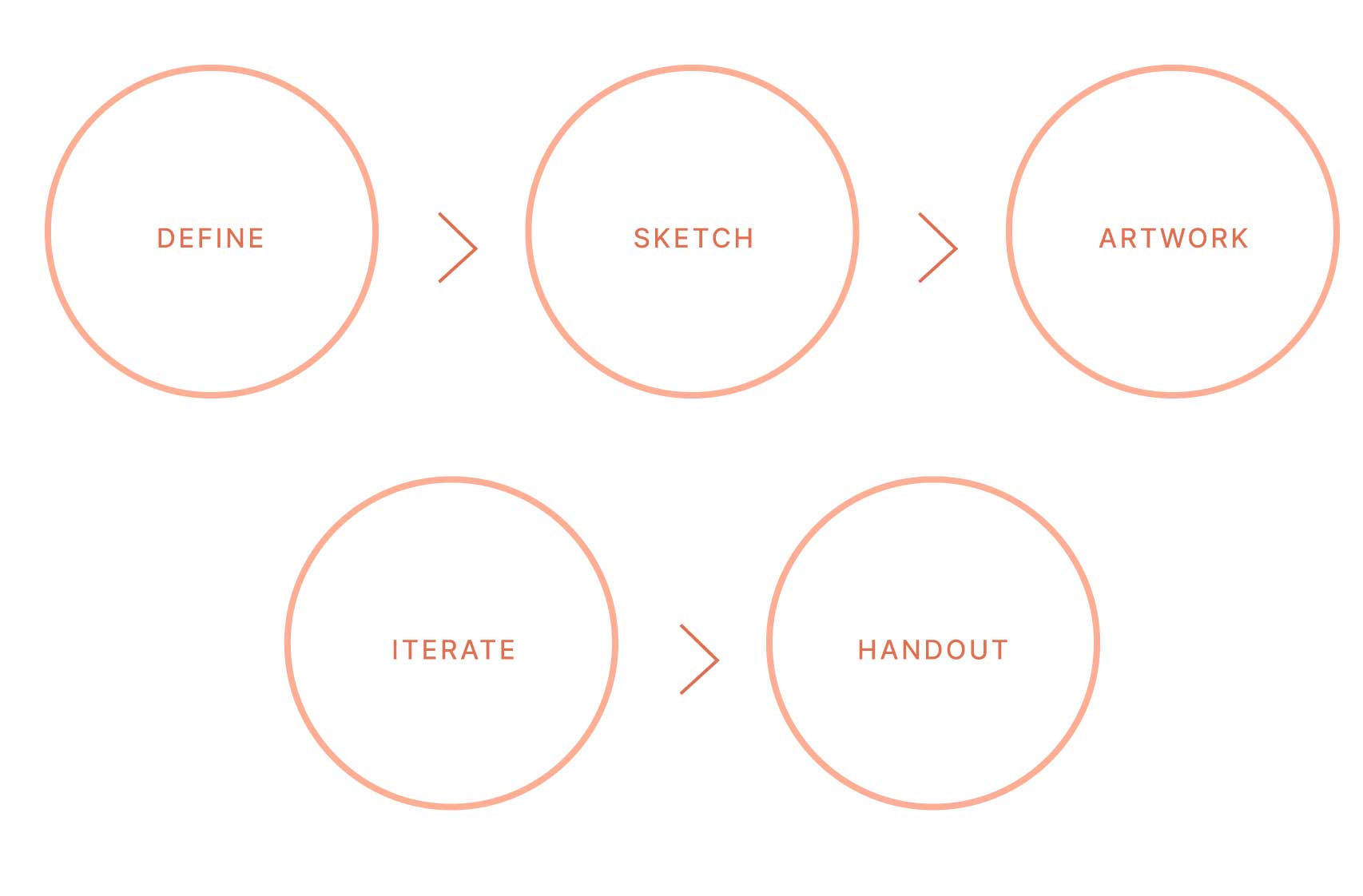
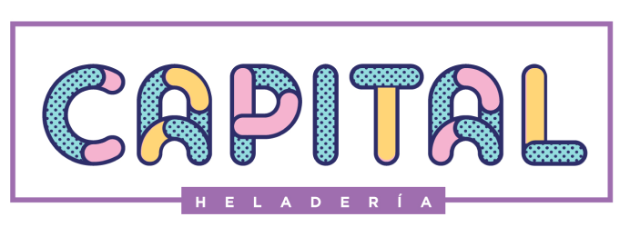
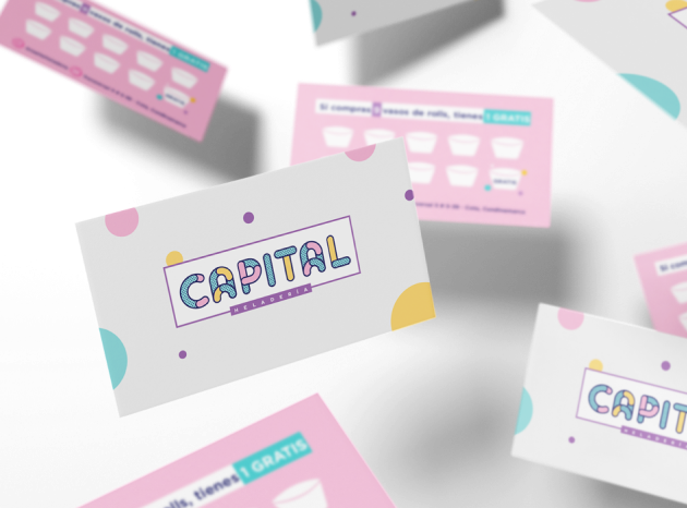
In developing this branding, I went through several stages to ensure the result would be effective and unique. In the initial stage of defining the brand, I conducted a survey to discover what ice cream evokes in people in town. Based on the most common responses of "happiness" and "delicious," I chose to adopt a playful and colorful style.

Isotype
COLOR PALETTE

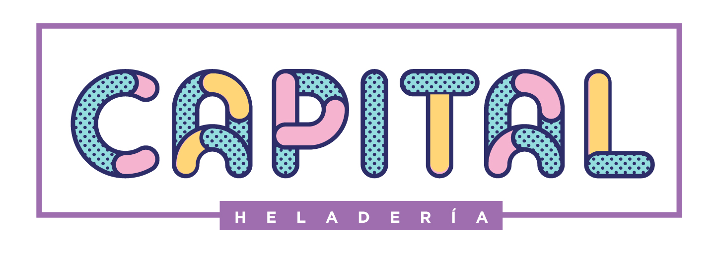
This color palette enabled me to experiment with the colors, resulting in a cohesive and distinctive outcome. The use of pastel colors aligns perfectly with the Capital brand, conveying a sense of playfulness and joy.

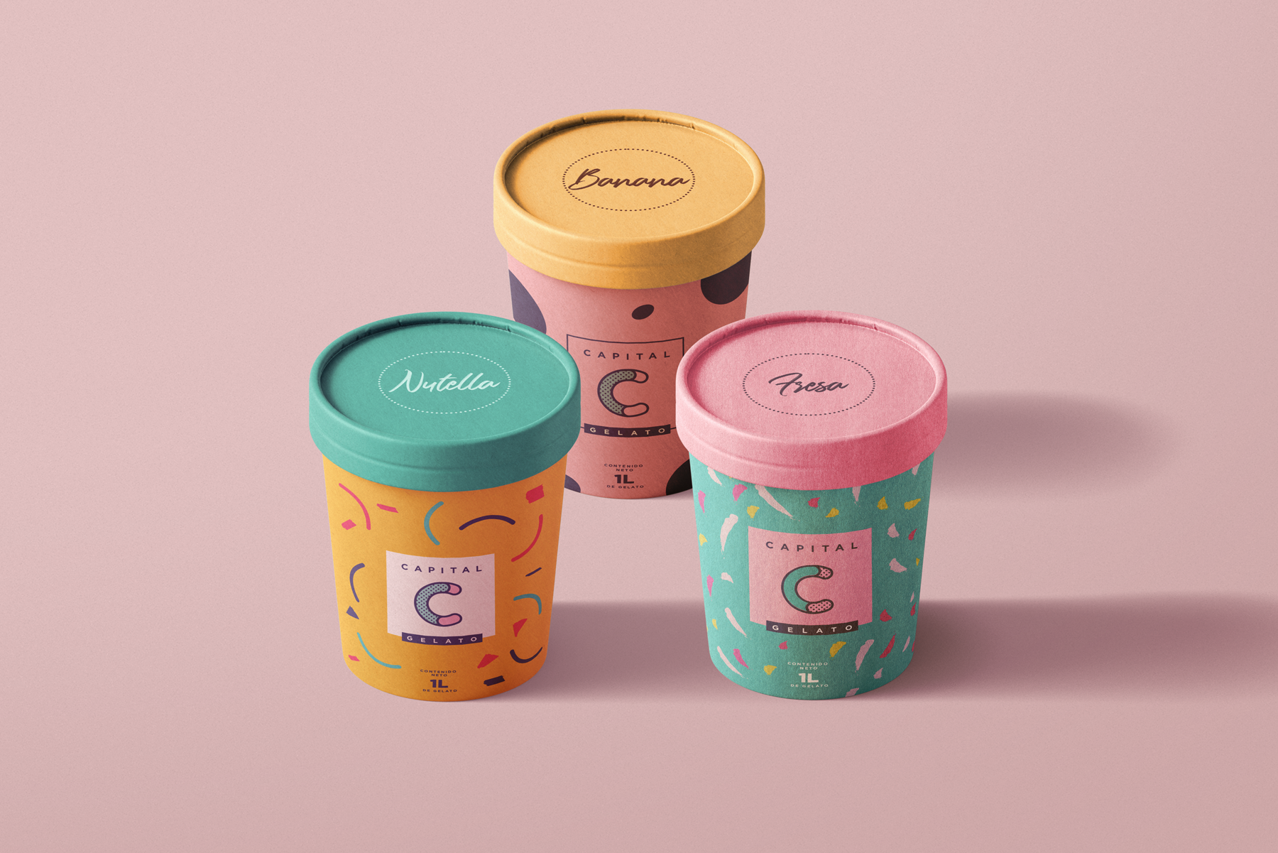
I not only designed a vibrant visual concept for Capital Heladeria, but also created versatile templates for social media content. These templates empower the client to share their own content while maintaining brand consistency. The visual concept has even elevated the brand, allowing them to sell ice cream in large takeaway packaging.

Some social media content

It's always a pleasure for me to assist local businesses. There's nothing more rewarding than being part of their growth and witnessing how their dreams come true; it's priceless!

Next project

Capital: blast of flavours and joyful

Capital Heladeria is a local ice cream store located in Cota, a little town close to Bogota, Colombia. I was so happy of coming alive this branding project where I put all my heart to make it real as it was a family business who strived to come true one of their dreams. And I was really glad to contribute!

My process

My process to create this branding passed for different stages in order to assure the outcome will be effective and unique. In the definition stage of Capital Branding, I asked people how they feel when they think of ice cream and many of them just seemed happy and delighted about it. Therefore, I decided to use a playful and colourful style since that’s what ice cream triggers.

Isotype
COLOR PALETTE

This tetradic colour palette allowed me to played with the colours to create a harmonious result that truly stands out. Pastel colours perfectly match with the concept of Capital brand because they convey playfulness and joyful.

I also designed some templates for social media content so the client was able to post their own content and use the templates to keep consistency within the posts. The visual concept has elevated the brand even to sell ice cream in large takeaway packaging.

Some social media content
Next project

It’s always a pleasure for me helping local businesses. There’s nothing more rewarding than being part of their growth and witness how their dreams come true, priceless!